Grid
The <Grid>, <Row> and <Column> components are used to arrange content and components on the grid within a page.
The math for the website is calculated using a 12 column grid at the large breakpoint, 8 column at medium (tablet) breakpoint and 4 column at the small (mobile) breakpoint. The design is based on a 16 column grid, however the math is calcualted with 12 to prevent having to add a offset class to each row.
To learn more about the grid is built, you can read the docs in the Carbon repo.
Grid
The <Grid> component is a wrapper that adds the bx--grid class to a wrapper div. You won’t need this when adding components to .mdx pages as this is already built into the template.
Code
Props
| property | propType | required | default | description |
|---|---|---|---|---|
| children | node | |||
| className | string | Add custom class name |
Row
The <Row> component is a wrapper that adds the bx--row class to a wrapper div. You will want to use this to define rows that you will place <Column> components inside of.
Code
Props
| property | propType | required | default | description |
|---|---|---|---|---|
| children | node | |||
| className | string | Add custom class name |
Column
The <Column> component is used to define column widths for your content, you can set the rules at different breakpoints with the props.
Example
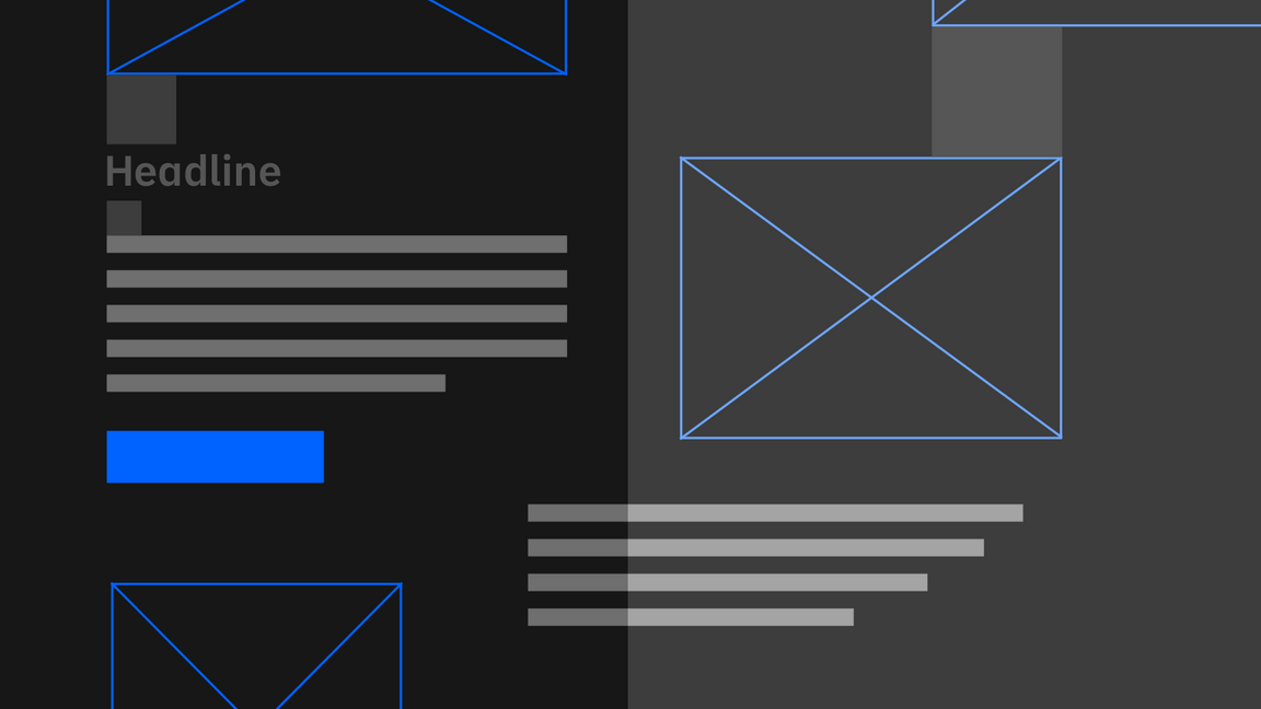


No gutter left


No gutter


Offset


Code
No gutter left
<Row><Column colMd={4} colLg={4} noGutterMdLeft></Column><Column colMd={4} colLg={4} noGutterMdLeft></Column><Column colMd={4} colLg={4} noGutterMdLeft></Column></Row>
No gutter
Offset
Props
| property | propType | required | default | description |
|---|---|---|---|---|
| children | node | |||
| className | string | Add custom class name | ||
| colSm | number | Specify the col width at small breakpoint | ||
| colMd | number | Specify the col width at medium breakpoint | ||
| colLg | number | 12 | Specify the col width at large breakpoint | |
| colXl | number | Specify the col width at x-large breakpoint | ||
| colMax | number | Specify the col width at max breakpoint | ||
| offsetSm | number | Specify the col offset at small breakpoint | ||
| offsetMd | number | Specify the col offset at medium breakpoint | ||
| offsetLg | number | Specify the col offset at large breakpoint | ||
| offsetXl | number | Specify the col offset at x-large breakpoint | ||
| offsetMax | number | Specify the col offset at max breakpoint | ||
| noGutterSm | bool | Specify no-gutter at small breakpoint | ||
| noGutterMd | bool | Specify no-gutter at medium breakpoint | ||
| noGutterLg | bool | Specify no-gutter at large breakpoint | ||
| noGutterXl | bool | Specify no-gutter at x-large breakpoint | ||
| noGutterMax | bool | Specify no-gutter at max breakpoint | ||
| noGutterSmLeft | bool | Specify no-gutter left at small breakpoint | ||
| noGutterMdLeft | bool | Specify no-gutter left at medium breakpoint | ||
| noGutterLgLeft | bool | Specify no-gutter left at large breakpoint | ||
| noGutterXlLeft | bool | Specify no-gutter left at x-large breakpoint | ||
| noGutterMaxLeft | bool | Specify no-gutter left at max breakpoint |